Role-based KPI dashboards built on a dedicated reporting engine. A CFO, a sales head, a warehouse manager and a plant manager each get a board scoped to the decisions they make — every figure traceable back to the iDempiere document that produced it.
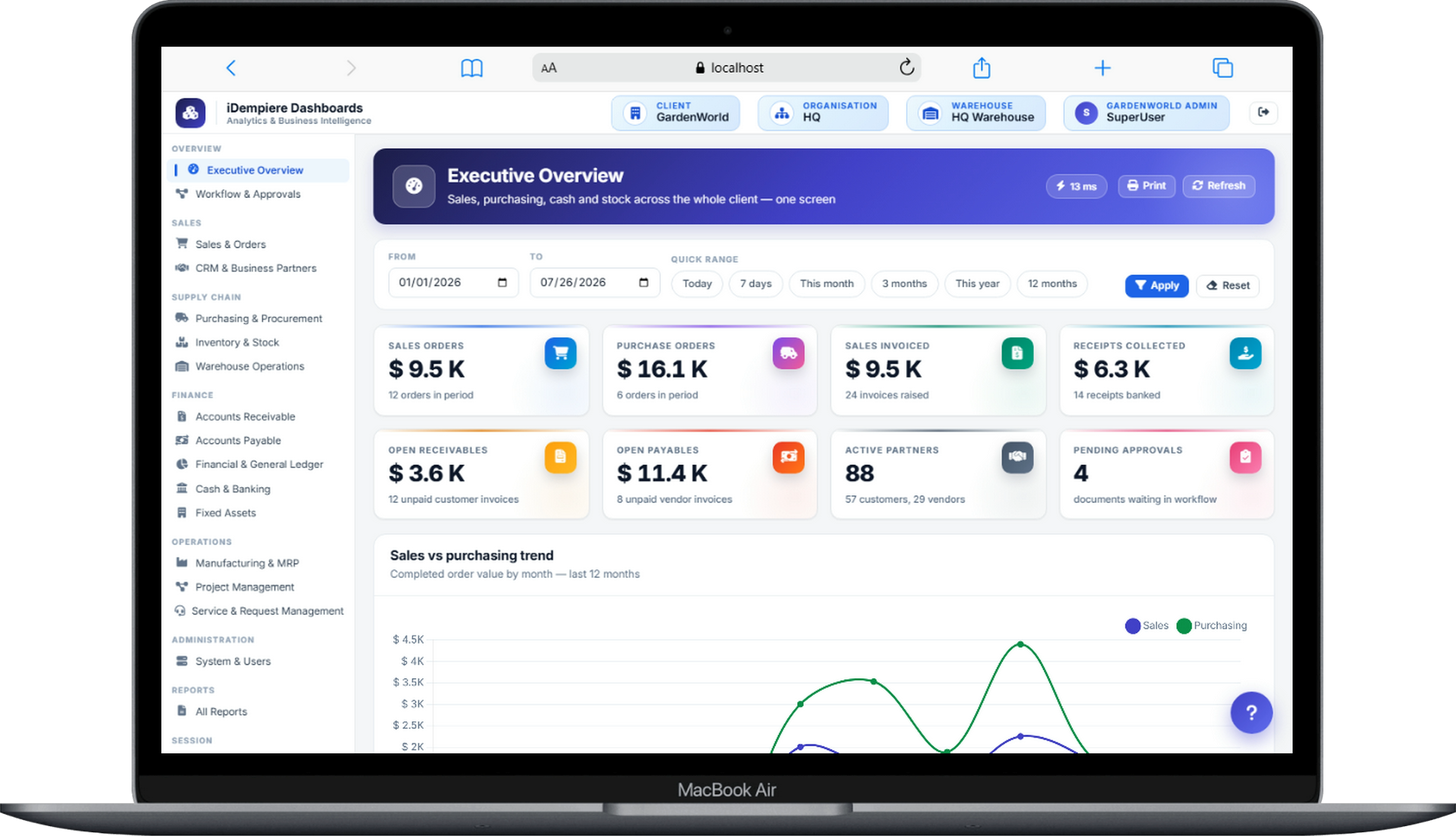
Dashboards & Analytics reads from a dedicated replica, honours the ERP's row-level security, and drills to the same source documents — so a chart on a screen and the underlying report can never disagree.
That inheritance matters. It means dashboards run with zero load on your production ERP, a branch manager sees only their organisation's tiles, and every headline number stays one click away from the invoice, shipment or journal behind it. A dashboard here is not a separate island of numbers; it is the reporting layer, made glanceable.
A dashboard is only useful if it is built for one person's decisions. We start from the role, not from the chart library.
Cash position, AR and AP ageing, DSO and DPO, gross margin, working-capital days and budget-vs-actual by account. The question behind the board: are we solvent, profitable and closing on time?
Bookings vs target, order backlog, win rate, margin by product and customer, and top-account concentration. The question: where is revenue coming from, and what is at risk this quarter?
Order fulfilment rate, pick accuracy, dock-to-stock time, ageing stock and open shipments. The question: are we shipping accurately and on time, and where is stock stuck?
Production order status, WIP value, yield and scrap, cost variance and on-time completion. The question: is the floor hitting plan, and where is cost leaking against standard?
A single page: revenue trend, gross margin, cash, order intake and one or two operational health metrics rolled up across the group. The question: is the business going in the right direction this month?
Every board above is a starting point we tune to how you actually run. The discipline is the same: a small set of KPIs each person will act on, and nothing they will merely glance at and forget.
Screenshots from our dashboard web app running on iDempiere — the same period filters, the same KPI tiles, the same drill-down on every figure.
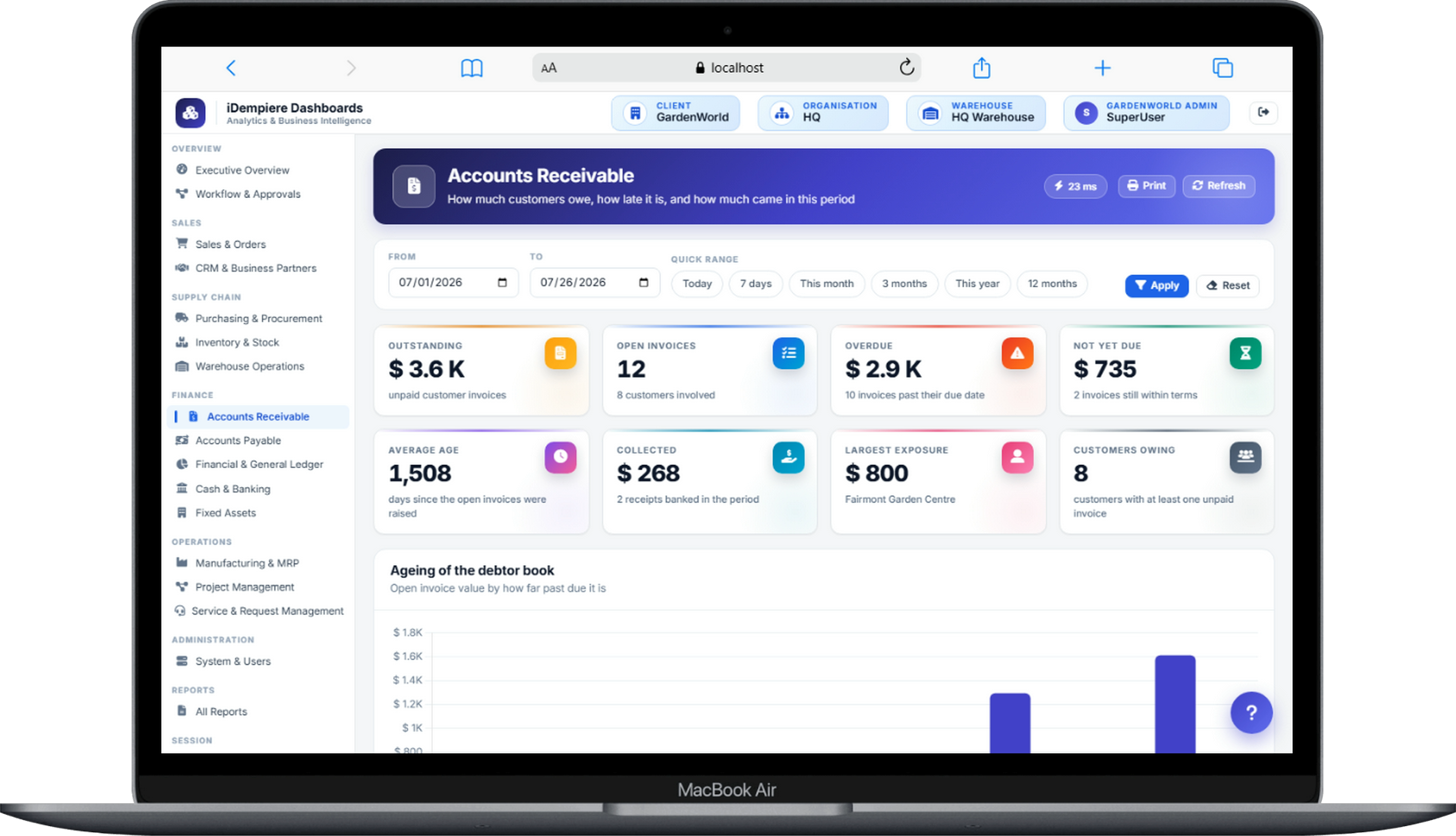
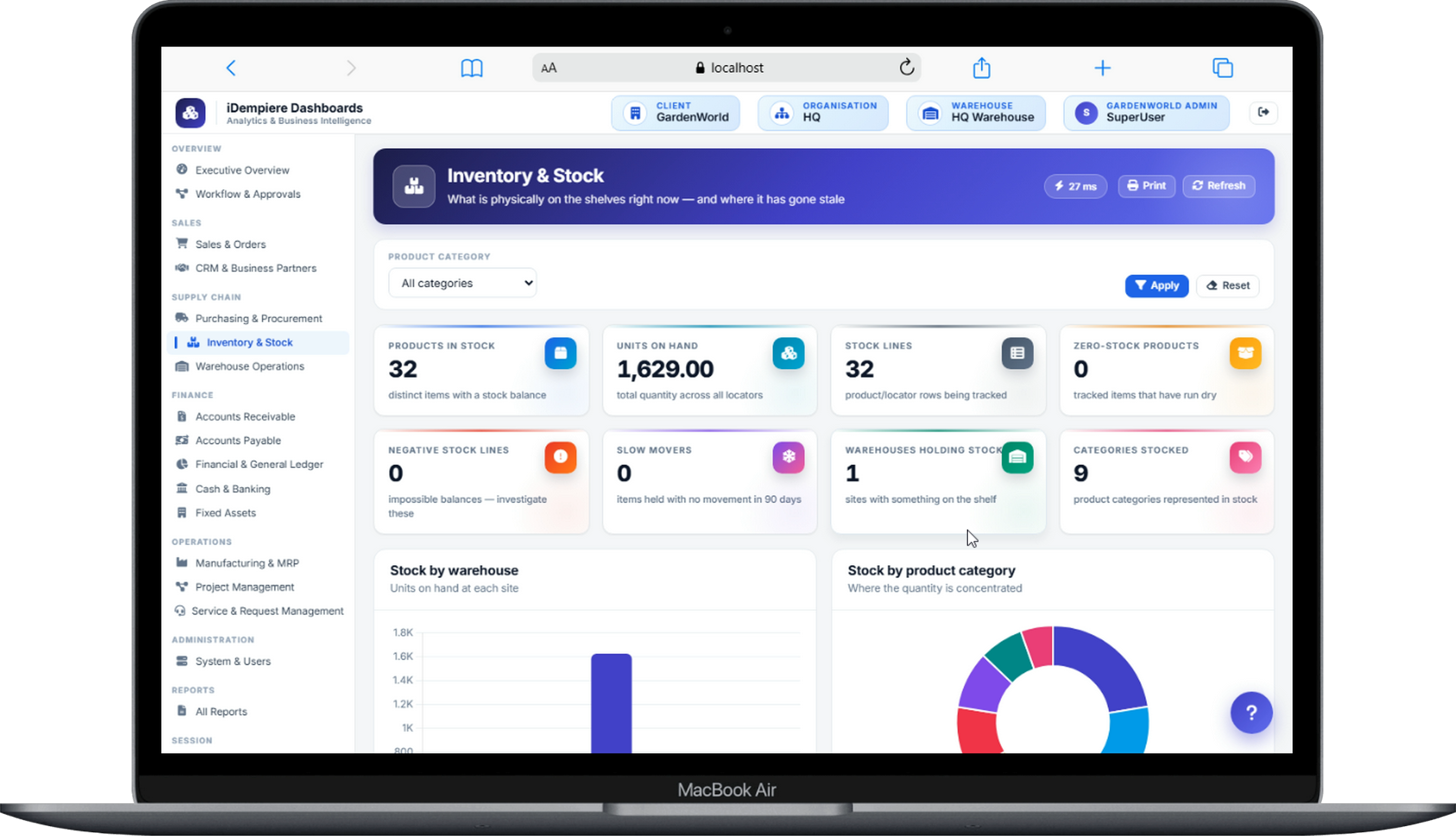
Each board carries its own filter bar — date range, organisation, warehouse or product category — and reports how long the query took, because a dashboard nobody waits for is a dashboard people keep open.
Every KPI ties to real iDempiere entities. This is what makes a figure defensible in a board meeting — you can always show the transaction underneath it.
| Role | KPI | iDempiere source |
|---|---|---|
| CFO | Days sales outstanding (DSO) | C_Invoice, allocations, payment schedule |
| CFO | Cash & bank position | Bank statements, cash journals |
| CFO | Budget vs actual | Fact_Acct, GL budgets, Accounting Schema |
| Sales head | Bookings vs target | C_Order (sales), sales targets |
| Sales head | Order backlog value | C_Order with open delivery/invoice status |
| Sales head | Margin by product / customer | C_Invoice lines vs cost of goods |
| Warehouse manager | Order fulfilment / on-time ship | C_Order vs M_InOut dates |
| Warehouse manager | Ageing stock | Storage On Hand, movement history |
| Warehouse manager | Dock-to-stock time | M_InOut (receipt) timestamps |
| Plant manager | WIP value | Manufacturing orders, cost collectors |
| Plant manager | Yield & scrap | Production reporting, BOM vs actual |
| Plant manager | Cost variance (actual vs standard) | Costing records, matched purchases |
| CEO | Revenue & margin trend | C_Invoice, Fact_Acct (consolidated) |
| CEO | Order intake | C_Order across organisations |
Start at the group revenue tile, drop to the region, then the customer, then the individual invoice. Each KPI has a defined path so a surprising number never dead-ends — you follow it to the record that explains it.
Set thresholds on the metrics that matter — DSO above 55 days, fulfilment below 97%, a customer past their credit limit — and the dashboard flags them and can email the owner. The board stops being something you remember to check and starts telling you when to look.
Because dashboards read the replica, refresh is decoupled from the ERP's own load. Operational boards refresh every few minutes; financial boards refresh on a schedule that matches the close. You set the cadence per board, not per whim.
Why near-real-time beats real-time for analytics. Chasing true real-time on a dashboard is usually a mistake. A metric that flickers every second can't be reasoned about, invites people to react to noise, and — if it hits the transactional database directly — steals performance from the very operations it is measuring. Reading a replica a few seconds or a few minutes behind gives a stable, consistent picture that is fresh enough to act on and cheap enough to run all day. For a KPI, a steady number you trust beats a twitching one you don't.
Month-end is where dashboards earn their keep. A period-close board shows the state of the close itself: unposted documents, open periods, unreconciled bank items, sub-ledger-to-GL differences and the checklist of tasks still outstanding.
Instead of a controller chasing people over email, everyone sees the same live picture of what is blocking the close. Because each item drills to the offending document, closing a gap is a click away from the number that flagged it. Teams that adopt a close board routinely take days out of their month-end, simply because nothing hides.
The close tasks and their owners appear on one board.
Unposted and unreconciled items drill straight to the document.
Sub-ledgers reconcile to the GL before periods close.
The signed-off pack distributes automatically on schedule.
Most dashboard projects fail the same way. Someone buys a tool, a wave of enthusiasm produces dozens of boards, and within a quarter almost none of them are opened. The charts were built because they were possible, not because a specific person needed a specific answer to make a specific decision. A dashboard with thirty tiles is not richer than one with six — it is one that no one reads.
We build the other way round. Every board starts from a person and a decision: what does this role do on a Monday morning, and which three or four numbers would change that action? Those become the KPIs. If a metric would not change anyone's behaviour, it does not earn a tile. We would rather ship the CFO five numbers they act on than fifty they scroll past.
The test we apply. For every KPI on a board we ask: who owns it, what do they do when it moves, and where does the number come from? If any of those three has no clear answer, the tile comes off. That single rule is what separates a dashboard people live in from wallpaper.
The result is a small number of boards, each with an owner, each drilling to source, each with a threshold that tells its owner when to care. That is also why we tie dashboards to roles rather than departments — a board with an owner gets used; a board owned by "everyone" gets used by no one.
We will build one role dashboard on a copy of your iDempiere data — a CFO, sales, warehouse or plant board — and show you the drill-down to source. No production load, no obligation.